
Colour is one of the most powerful tools in a designer’s toolkit. It can be used to evoke emotions, create a hierarchy, and guide the user’s attention. When it comes to user experience (UX) design, colour is especially important. A well-designed colour scheme can make the difference between a user-friendly interface and one that is confusing and frustrating. In this blog post, we will discuss the main principles of colour scene in UX design and how to use them to create an effective user experience.
Create Hierarchy
The first principle of colour in UX design is to use colour to create a hierarchy. Hierarchy is the organization of elements in a design in order to indicate their importance. For example, a button that initiates an important action should be a different colour than a button that is used for navigation. By using different colours to indicate different types of buttons, the user will be able to quickly identify the important actions and navigate the interface more easily.
Guide User Attention
The second principle of colour in UX design is to use colour to guide the user’s attention. The human eye is naturally drawn to certain colours and patterns, so designers can use this to their advantage by highlighting important information or calls to action in a contrasting colour. For example, a red button on a white background will stand out more than a blue button on a white background. By using colour in this way, designers can guide the user’s attention to the most important elements of the interface.
Colour Evoke Emotions
The third principle of colour in UX design is to use colour to evoke emotions. Different colours can evoke different emotions in people. For example, red is often associated with danger, while blue is associated with calmness. Designers can use this to their advantage by choosing colours that will evoke the desired emotions in the user. For example, a financial app might use cool blue tones to rely on the notion to be reliable and trustworthy.
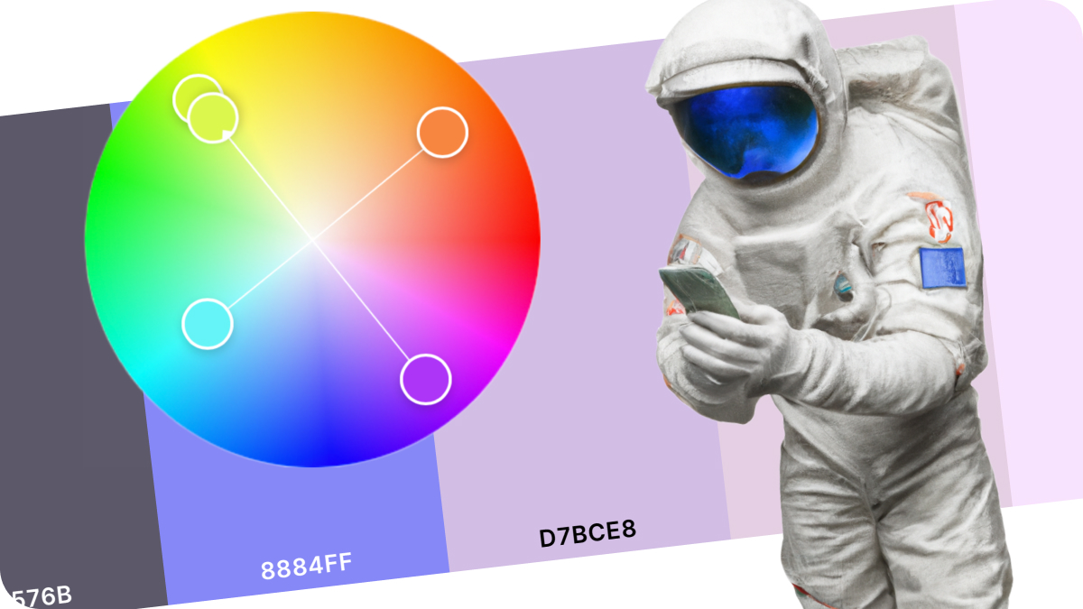
Luckily there are many ressources online that will help and guide or provide inspirations in creating a suitable and interesting colour scheme. Here some of my favourits:
Grabient: Find beautiful Gradients
Perfect Palette Generator: The fastest way to get inspired to a new palette.
Adobe Color Palette Generator: Incredible versatile and soo mny options.
ColorSpace: A great colour gradient and palette generator.